
Your BFCM ads might be working. Your landing pages might be killing the conversion.
For most US DTC brands, Black Friday and Cyber Monday traffic is the single biggest spike of the year—but the brands that win aren’t always the ones with the biggest ad budgets. They’re the ones whose landing pages are built to convert that traffic, not just receive it.
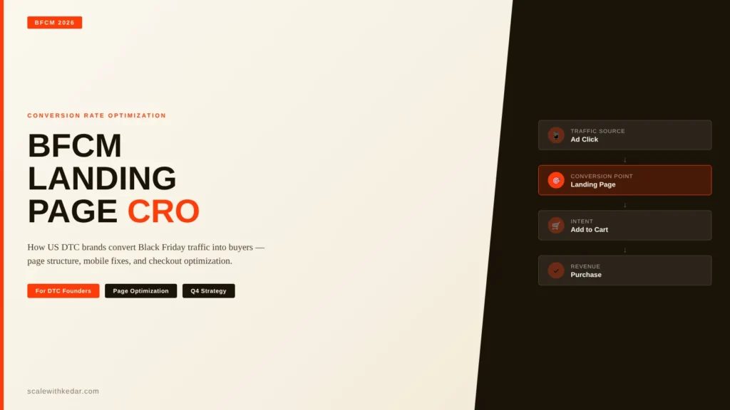
This guide covers the specific landing page and product page decisions that determine whether a BFCM visitor becomes a buyer: page structure, above-the-fold priorities, trust signals, checkout path, and mobile experience. These are the same areas I audit when working with DTC clients on Q4 CRO prep—and fixing them before BFCM is almost always higher leverage than increasing ad spend.
Why BFCM Landing Pages Fail (Even With Good Ads)
Most DTC brands send BFCM ad traffic to one of three destinations: the homepage, a standard product page, or a generic collection. All three share the same structural problem—they’re not built around a single intent.
BFCM visitors arrive with a specific job: find the offer, evaluate it fast, and decide. Generic pages ask them to do extra work: navigate to the right product, find the deal, understand what’s included, and trust that the brand will deliver.
Every additional step between the ad click and the “add to cart” is a conversion leak. A dedicated BFCM landing page eliminates most of those steps by front-loading the offer, the value proof, and the decision information.
The two most common failure patterns I see on BFCM audits:
- Generic product pages carrying BFCM traffic: Standard product pages aren’t built to handle urgency framing, offer stacking, or BFCM-specific objections. Visitors see the same page that’s live year-round, which undermines the deal’s perceived value.
- Slow mobile pages under traffic load: A 0.1-second improvement in load time can lift mobile conversions meaningfully. Many brands discover their page speed problems for the first time during the BFCM traffic spike, when it’s too late to fix.
The Anatomy of a High-Converting BFCM Landing Page
A BFCM landing page isn’t just a product page with a banner added. It’s a focused conversion experience built around one offer and one decision. Here’s what high-performing BFCM pages share:

1. A Benefit-Led Headline That States the Offer Immediately
Your BFCM visitors already know it’s sale season. They don’t need build-up—they need to understand the deal in the first five seconds.
Weak headline: “Our Biggest Sale of the Year”
Stronger headline: “30% Off Sitewide — Free Shipping on All Orders Over $50 Through Monday”
The second version tells the visitor exactly what they’re getting and when it ends. That’s information they can use to make a decision. The first is a marketing statement that delays the decision.
2. A Single Primary Product or Offer Above the Fold
Brands that spread BFCM landing pages across ten products typically see worse conversion than brands that focus on two or three. Giving visitors too many choices at BFCM—when they’re already context-switching across dozens of deals—increases decision fatigue and reduces the likelihood of any purchase.
If you have a large catalog, organize BFCM pages by buyer type or gift occasion rather than by product category. This reduces the choice set while keeping the offer relevant.
3. Specifics That Replace Generic Claims
On a BFCM page, every element should earn its space by helping the visitor decide. Some replacements that consistently perform better in audits:
- Replace “high quality” with the specific material, certification, or test data that substantiates the quality claim.
- Replace “customers love it” with a specific review quote tied to the problem the product solves.
- Replace “limited offer” with an honest and verifiable deadline (when the sale genuinely ends).
- Replace “bestseller” with the specific customer outcome: “used by 14,000+ home bakers” means something a visitor can evaluate.
4. Objection Handling in the Right Sequence
BFCM visitors share predictable objections: Is this actually a good deal? Will it arrive in time? What if I need to return it? Can I trust this brand?
Place answers to these questions below the product information but before the primary CTA. This is not a FAQ section—it’s specific, concise copy that removes the most common reasons a motivated visitor might not convert:
- Free returns or easy exchange policy
- Specific delivery windows for standard and expedited shipping
- Price match guarantee if applicable
- The offer’s exact end date
5. One Clear Primary CTA Per Section
Multiple competing CTAs on a BFCM page reduce conversion by forcing visitors to evaluate options instead of taking action. Each section of the page should have at most one primary CTA, and it should be directionally clear: the visitor should know exactly what will happen when they click.
“Add to Cart — Get 30% Off” is better than “Add to Cart” because it reinforces the offer at the decision moment.
Mobile CRO: The Real BFCM Battleground
In most US DTC categories, 65–75% of BFCM traffic now arrives on mobile. But mobile conversion rates on most DTC sites are 30–50% lower than desktop. That gap is almost entirely a UX problem, not a traffic quality problem.

Page Speed
BFCM visitors are impatient and context-switching. Pages that take more than 3 seconds to load on mobile lose a significant share of traffic before anyone sees the offer. The key inputs:
- Image weight: Hero images on mobile BFCM pages often exceed 1MB. WebP with proper responsive sizes should bring this under 200KB without visible quality loss.
- Third-party scripts: Chat widgets, analytics layers, and social proof apps loaded synchronously in the <head> block render time. Defer non-critical third-party scripts until after initial page load.
- LCP element: The hero image or offer headline is usually the Largest Contentful Paint element. Preloading it with <link rel=”preload”> can meaningfully reduce LCP on mobile.
Checkout Path Friction
On mobile, checkout friction is higher because form entry is slower and errors are harder to recover from. Three fixes that reduce mobile checkout abandonment:
- Auto-apply the BFCM discount at checkout: Requiring visitors to find and enter a code is a meaningful drop-off point, especially on mobile. Apply the discount automatically based on URL parameter or cart content.
- Lead with one-tap payment options: Shop Pay, Apple Pay, and Google Pay reduce checkout time dramatically on mobile. Position these above the standard form.
- Minimize form fields: Remove any field that isn’t necessary for fulfillment. On mobile, every additional field reduces conversion.
Tap Target Sizing
CTA buttons, navigation links, and add-to-cart buttons need to be large enough to tap accurately on a phone screen. Minimum 44×44px tap targets; for primary CTAs on a BFCM page, 48–56px height with adequate padding is standard.
Trust Signals Under BFCM Conditions
BFCM traffic often includes visitors who aren’t familiar with your brand—they found the deal through an ad, a roundup, or a comparison. These visitors need more trust evidence than a returning customer does.
Trust signals that work on BFCM pages:
- Verified review counts and ratings near the product (with a source visible—not just a star graphic)
- Real customer photos showing the product in use
- Specific delivery and return commitments with exact dates
- Payment security indicators near the checkout CTA (SSL, accepted payment logos)
- Founder or brand story for newer or smaller brands where trust is a real barrier
Trust signals that don’t help (and sometimes hurt): generic “award-winning” claims without a named source, countdown timers that reset when the visitor refreshes the page, and artificial “X people viewing this” notifications.
The BFCM Page Testing Window Is Now
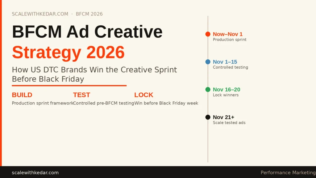
Most BFCM CRO prep that produces results happens 6–8 weeks before the event—not the week before. That puts the effective testing window right now.
A practical pre-BFCM testing priority:
- Run your current top product pages through a mobile speed audit (PageSpeed Insights, GTmetrix) and address anything below 70 on mobile performance
- Review the checkout flow on mobile end-to-end—add an item, apply a discount code, go through checkout, and note every friction point
- Check your above-the-fold experience on three different mobile screen sizes (small Android, standard iPhone, larger iPhone)
- Verify that BFCM discounts auto-apply from your paid traffic URLs without requiring manual code entry
- Set up session recording on your BFCM landing pages for the two weeks before the event so you have behavioral data to diagnose problems during the event
What a BFCM Page Audit Actually Covers
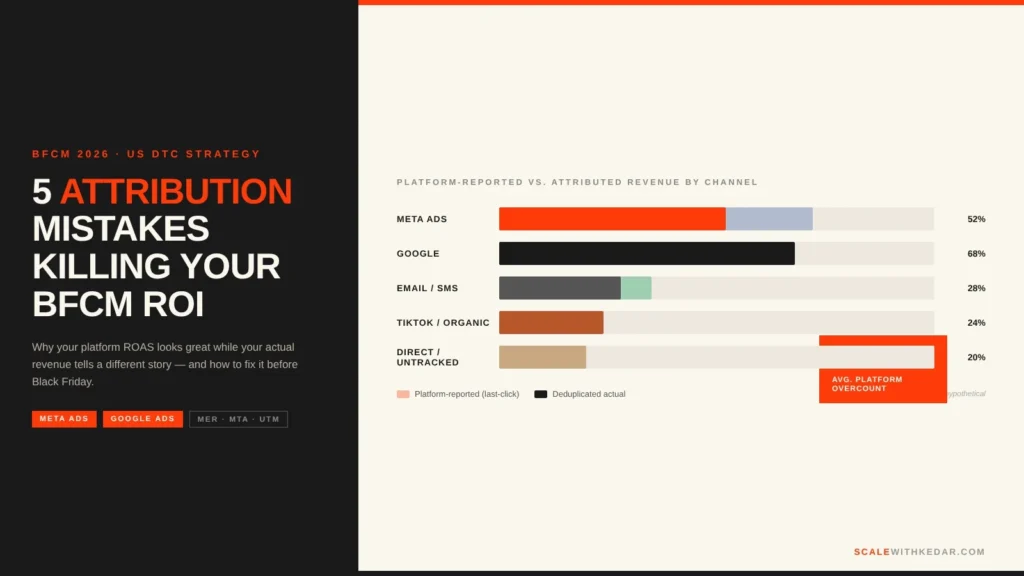
When I audit a DTC brand’s BFCM readiness, the landing page and product page work is one part of a broader conversion assessment. The full picture includes attribution setup, audience segmentation, email/SMS flows, offer architecture, and post-purchase strategy—all of which interact with what happens on the landing page.
If you’re a US DTC founder or marketing lead heading into Q4 and you’re not confident in how your pages are set up, the most useful thing you can do right now is a structured audit before you scale your BFCM spend.
Reach out here to discuss a pre-BFCM CRO audit for your brand. I work with US DTC brands on Q4 preparation—identifying the specific page and flow changes that will have the most impact before the traffic spike arrives.
Frequently Asked Questions
Should I create a dedicated BFCM landing page or optimize existing product pages?
Both, in order. Optimizing your top product pages is the foundation—those pages carry year-round traffic and are where most BFCM conversions will happen. A dedicated BFCM landing page is the additional step for brands running paid traffic to a specific offer, where you control the entire experience from ad click to cart.
How early should I start BFCM landing page prep?
Structural changes (page architecture, checkout flow, speed) need 6–8 weeks. Design and copy can be finalized 2–3 weeks out. Offer mechanics and discounting should be confirmed 2 weeks out so your paid and email teams have final assets.
What’s the single highest-impact BFCM page change for most DTC brands?
Based on what I see across audits: auto-applying discounts instead of requiring code entry. The drop-off rate at “enter discount code” on mobile during BFCM is significant, and it’s a technically simple fix for most Shopify setups.
How do I prioritize which landing pages to optimize first?
Start with the pages receiving the most BFCM paid traffic and the pages with the highest add-to-cart rate but lower checkout completion. Those are the pages where conversion improvements compound the most.